The Olympic torch relay, inspired by an ancient Greek custom, heralds the beginning of the Olympics, spreading messages of peace and friendship along its path. Observing the torches from various Olympic Games offers a glimpse into the evolving creative philosophies of renowned design teams from around the world. From the ancient symbol of civilization—the fire torch — to modern designs used in the Olympic Games, each torch uniquely represents the host country and the spirit of the Games. The first such design was introduced at the 1936 Berlin Summer Olympic Games. Sports aside, the Olympics is also a captivating competition of aesthetics.
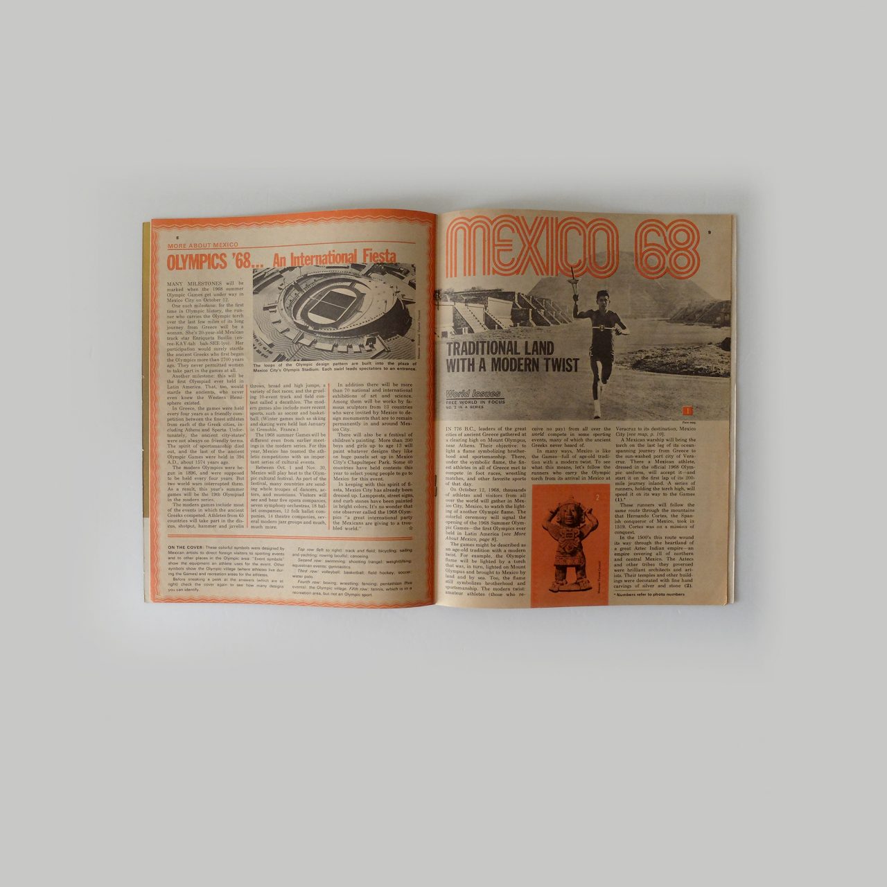
Magazine reports of the 1968 Mexico City Olympics. The editors linked the torch relay to graphic design and traditional Native American culture.

The Design Race
To ensure that the Olympic flame could withstand wind and rain during its relay, and to keep it from extinguishing, the original Olympic torch was designed as a functional candelabrum. The top featured a circular disc that safely covered the internal windproof structure. From today’s aesthetic perspective, this design was purely utilitarian, with only the Olympic rings engraved and the name of the host city cast on it. The windproof ring resembled ancient inscriptions on bells and tripods, and early torch designs, such as the one used in the 1948 London Olympics, adhered to traditional craftsmanship.
The 1964 Tokyo Olympics saw an attitude shift towards design, and the Mexico City and Munich Olympics seemed to engage in a conceptual race. By 1968, West Germany had caught up with Mexico in terms of design progress, and both teams independently introduced a groundbreaking concept (which now seems obvious): on top of the five Olympic rings, they introduced a primary logo and a commercial logo, and integrated it into the finished product. This meant that circular elements appeared on the crown of the 1968 torch – in fact, the torch’s entire appearance was an extension of the MEXICO68 logo text. Meanwhile, the 1972 torch displayed its logo on the base. Germany took minimalism to the extreme, using a sleek metal rod that passed through a disc, combining the functions of a torch and a baton. Compared to the “silver bowl” of 1948, the Olympics have made a significant stride towards modern design.
The Sydney Olympics: A Millenial Masterpiece
A truly groundbreaking design emerged at the turn of the millennium in Sydney. The designers used a combination of white, blue and silver colours to create a futuristic design. The use of silver was inspired by the Sydney Opera House, and the blue and white by the sky and clouds over Australia’s Pacific coast. The boomerang shape of the torch pay homage to traditional Aboriginal culture. The Blue Sky Design utilised three types of material, all containing stainless steel, to create an arc shape, with each layer representing the elements earth, water and fire. The outer layer was made from treated aluminium, the blue middle layer from anodised aluminium with an oxide layer, and the Olympic logo was positioned at the top of the torch. In the photo, it’s shown at an angle that reminds the viewer of the famous Sydney Opera House meeting the skyline.
This move towards a stylish and elegant Olympic torch design deeply influenced subsequent iterations, allowing the appearance to evolve gracefully like growing branches. The sleek curves replaced the purely rational straight lines of German designs. From this new starting point, post-millennium torch designs embraced these elements. For instance, the often overlooked 2012 London Olympics torch, designed by Edward Barber and Jay Osgerby, featured a triangular column structure symbolizing the Olympic motto “Citius, Altius, Fortius” (Faster, Higher, Stronger). The torch design was hence infused with new meaning, which continues to this day.
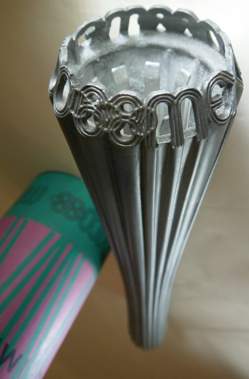
The MEXICO68 inscription is deliberately left with gaps to allow even more refraction of the flame’s light, giving the torch design an even more complex aesthetic.
The Mexico Olympics used pictograms, where the designer used simplistic lines to create a sense of the torch’s movement.
The Mexico Olympics: Incorporating Modern Corporate Design
For any collector passionate about Olympic design, each torch holds a unique place in their heart. To satisfy the public’s desire to “participate” in the Olympic excitement, host cities and countries produce an array of flags and commemorative coins, like stars in the sky. However, the 1968 Mexico Olympics truly pushed the envelope by creating a torch that people could hold and feel, turning it into a commemorative item for sale.
Among the various memorabilia from that year, a notable cast iron torch designed by Pedro Ramirez Vazquez and Eduardo Terrazas stood out, packaged in a distinctive pink paper tube. It features a flowing curved line with the MEXICO68 logo at the top, as well as a casting which added to the glow of the fire when it was lit. In addition to the Olympic posters, visual designer Lance Wyman also designed exclusive pictograms of the Olympic flame; he places twisting, overlapping torch images in the centre, whilst a burning ring of light surrounding the flame provides it with a sense of movement.
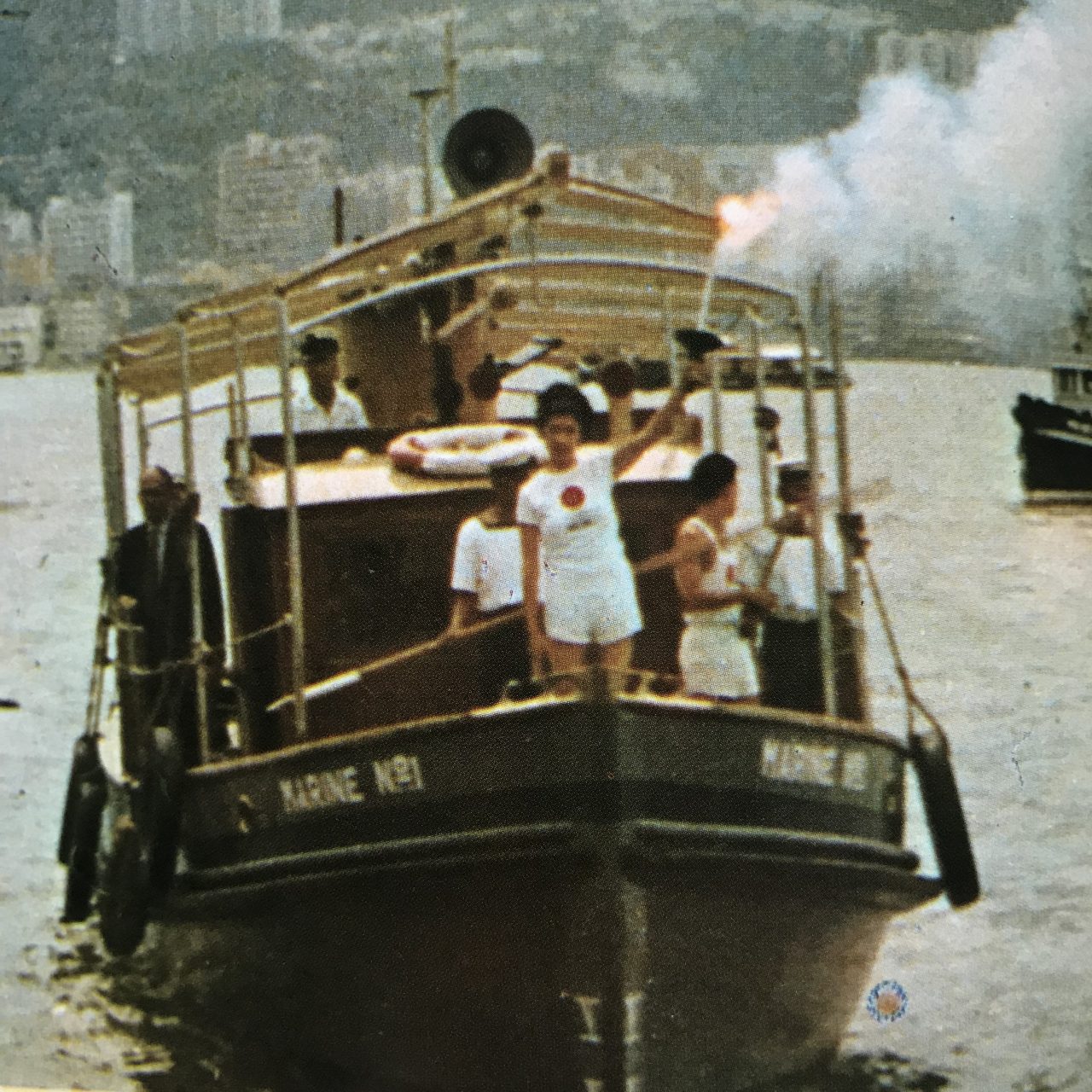
The precious moment when the Olympic flame crossed the harbour from Kowloon to Hong Kong by ferry in 1964, carrying with it love for and memories of the city.
The Tokyo Olympics: Hello Hong Kong!
How engaged were Hong Kong spectators during the early days of the Olympic torch relay? This photograph uncovers a charming story between the Tokyo Olympics and Hong Kong. In 1964, the Tokyo Olympic torch relay, which lasted two months, toured various parts of Asia to promote the Olympic spirit of friendship and peace before finally arriving in Japan. On September 1st of that year, the torch reached Hong Kong amidst a typhoon, which caused inevitable disruptions to the scheduled parade. The Olympic torch’s special plane, ANA “City of Olympic,” experienced engine failure and required emergency repairs, grounding the flight. A replacement aircraft, the JAL Convair 880 sent from Japan’s Haneda Airport, also encountered issues, causing further delays.
Pictured above is a scene from the official report – the precious moment when the Olympic flame crossed the harbour from Kowloon to Hong Kong by ferry. The misty haze and the silhouette of Hong Kong’s mountains in the background evoke a sense of nostalgia. It wasn’t until September 7th that the JAL support plane, dubbed the “Torch Plane,” reached its next destination in Taiwan. The relay then continued to its final stop in Naha, Okinawa, before flying to Japan for a nationwide tour, culminating in Tokyo.
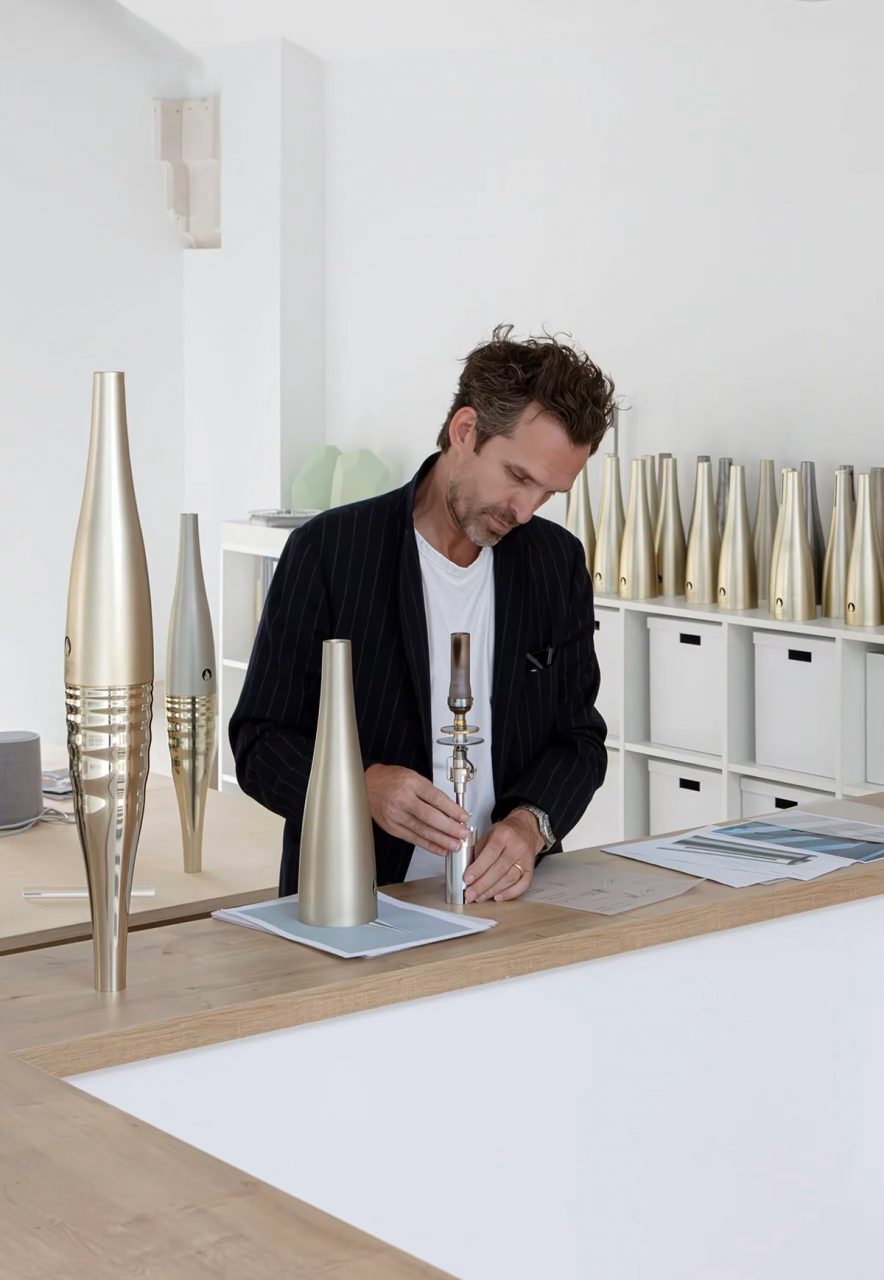
French designer Mathieu Lehanneur employs equality, water, and peace as symbols in the crafting of this year’s Paris Olympics torch.
The Paris Olympics: From Tradition To Modernity
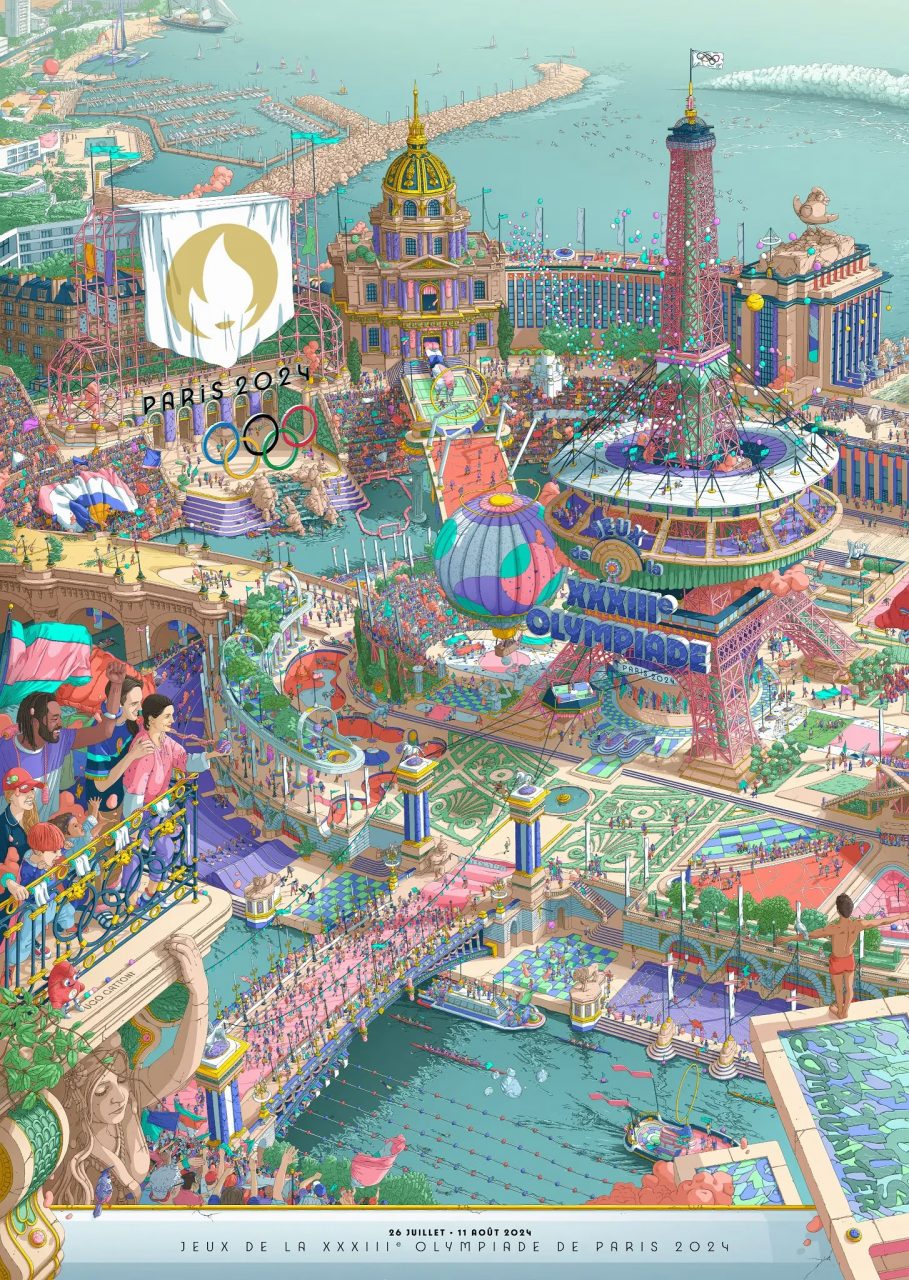
The champagne-colored Olympic torch for the Paris Olympics, designed by French designer Mathieu Lehanneur, is a masterpiece of modern design. Lehanneur described the torch, saying, “The torch’s perfect symmetrical proportions symbolise equality; its curves, surface relief, and vibration effects symbolise water, and the softness of its curves represents peace.” The torch relay ceremony, which was full of modern dynamism, lasted for two days, and was completed last week, after the torch was transported through France before arriving in Paris, its capital on Bastille Day (the fourteenth of July, also France’s National Day). This vibrant and modern Olympic torch relay ceremony in Paris was completed just last week. The two-day relay began on Bastille Day (July 14th, France’s National Day), with French football legend Thierry Henry taking on the first leg of the relay. The torch journeyed through many of Paris’s historic, artistic, and cultural landmarks, including the Grand Palais, the Panthéon, Victor Hugo’s House, and the Place de la Bastille. The relay’s grand finale took place under the traditional Bastille Day fireworks display at the Eiffel Tower. The entire event, reminiscent of a festive carnival as depicted in the official poster, marked the countdown to the Olympics.


Editor
Benjamin AUCredit
Photo courtesy of IOC

