Olympic posters have long been an integral part of the Games, showcasing the host city’s identity and heritage. The Tokyo 1964 Olympics marked the first adoption of modern design concepts in posters. Breaking away from painting traditions, the new posters embraced modern graphic design and pioneered a completely new visual form. Beginning with Rome 1960, the evolution of visual design will be traced through Olympic posters up until the present.
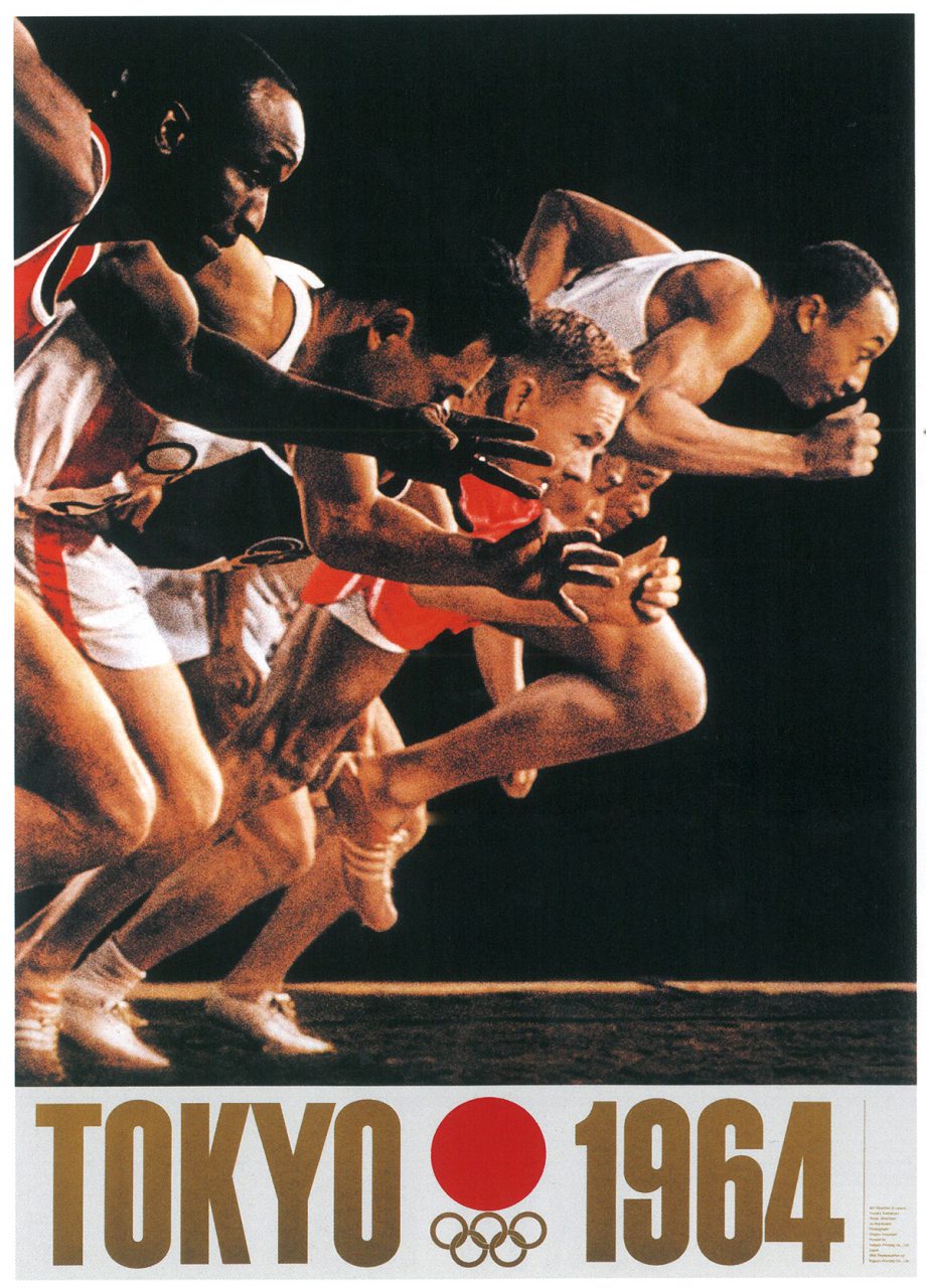
1964 Tokyo Olympics poster designed by Yusaku Kamekura and photographed by Osamu Hayasaki and Jō Murakoshi at the National Stadium.

Tokyo 1964 Olympics
Spearheaded by Hiromu Hara, the 1964 Tokyo Olympics was the first to utilise modern design concepts with a distinguished team of Japanese designers. The team included prominent figures such as Yusaku Kamekura, Takashi Kono, Ryuichi Yamashiro, Ikko Tanaka, Jae Asutsu, Kohei Sugiura, Mikio Katsui, and Shigeo Fukuda, in coordination with the design critic Masaru Katsumi.
The iconic poster for the 1964 Summer Olympics was crafted by Yusaku Kamekura and photographed by Hajime Hayasaki and Xiang Murakoshi at the National Stadium, with a total of 90,000 B1-size posters printed. Kamekura’s design features a prominent red circle representing the spirit of Japan, proportioned to closely match the Olympic Rings. The photographs of runners feature geometric elements to convey the explosive power of competitions. The innovative composition of the poster meant that it was often regarded as a milestone in modern Olympic design, paving the way for future posters.
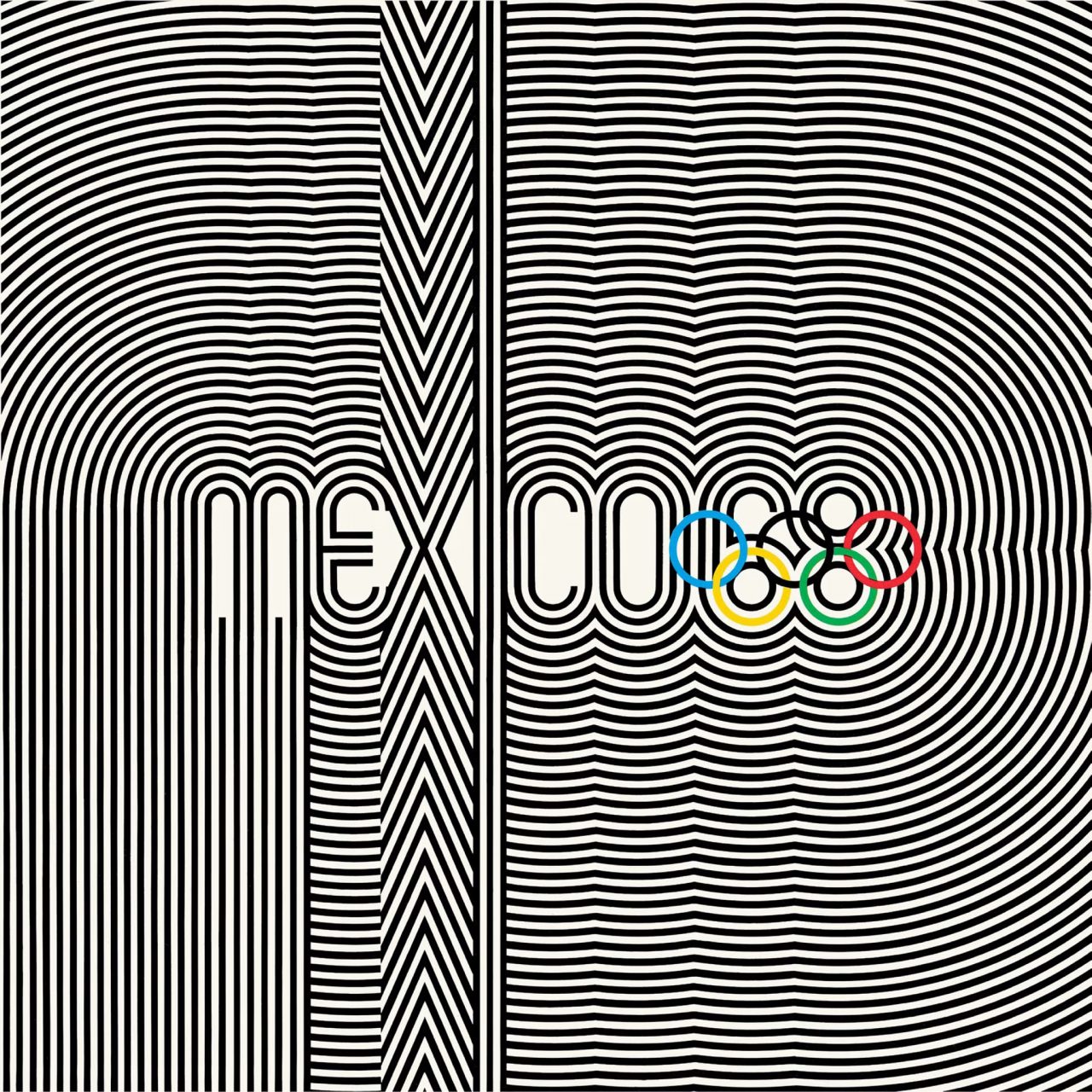
The Mexico City 1968 Olympics poster, designed by Lance Wyman, fuses the country's cultural traditions with modern design.
Mexico City 1968 Olympics
The 19th edition of the modern Olympic Games, held in Mexico City, showcased the “MEXICO 68” logo, designed by Lance Wyman. The composition of radial and extended lines, coupled with the use of bright colours, emphasises Mexico’s cultural heritage. The iconic gradual radial circle and contrasting colours set a precedent for future Olympic designs to be feats of highly accomplished aesthetics.

The Munich 1972 Olympics Art Poster was designed by Max Bill, balancing colour and composition.
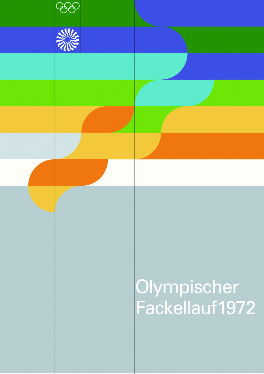
The Munich 1972 Olympics poster, based on the theme of the “Olympic Torch”, was designed by Otl Aicher and Rolf Müller.
Munich 1972 Olympics
The Munich 1972 Olympics stands out as one of the most iconic in terms of graphic design. In particular, the work of German graphic designer Otl Aicher has gained renewed appreciation in recent years. Aicher and his team developed a strict design system for the Munich Olympics, characterised by a raster layout and a very specific colour palette. The poster features the Olympic Torch, the Olympic Park, and the Olympic Tower in blue, green, and silver. The design-oriented layout, simple geometry, and consistent use of the raster system carved a unique aesthetic for the Games.

The Munich 1972 Olympics posters have since become icons in design and art, coveted by collectors. Germany had begun meticulously planning the visual and aesthetic aspects of the games very early on, even before the 1968 Olympics in Mexico. The country invites a score of designers and artists to contribute. Exhibitions and sales of posters were organised pre-Olympics, extending the reach of these designs beyond the sporting event itself. Notably, Max Bill, a Bauhaus pioneer and director of HfG Ulm, contributed to these efforts, solidifying the posters’ impact and fostering international recognition.
The influence of Olympic posters extended beyond graphic design and into visual art. For instance, the swimming poster designed by artist David Hockney for the Los Angeles 1984 Olympics used his famous Polaroid photo collage technique, capturing the essence of summer and later becoming a beloved piece of home decor. In the same year, he also created a similar skating poster for the Winter Olympics. Hockney’s work exemplifies how Olympic posters can transcend beyond their original function, evolving into cherished artwork for the years to come.
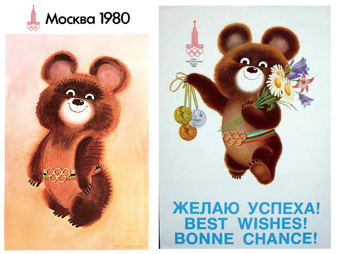
The Moscow 1980 Olympics poster series featured the mascot, Misha. The hand-drawn effect used on the brown fur was reminiscent of children's book illustrations.
Moscow 1980 Olympics
Graphic design, artistic flair, famous photographs… Among all Olympic poster designs, Moscow 1980’s stood out for many reasons. In addition to the former Soviet Union’s famous political propaganda posters, other posters featured a mascot, Misha the brown bear, a character created by picture book author Victor Chizhikov. Under Chizhikov’s brush, Misha’s colourful sash, Olympic rings, and lively personality made him a popular mascot at the Games.

The posters for the 2000 and 2004 Olympic Games showcased a fresh, nature-inspired style.

The posters for the 2000 and 2004 Olympic Games showcased a fresh, nature-inspired style.
The Olympics in the New Millennium
The Sydney 2000 Olympics marked a new generation of poster design at the turn of the millennium. The poster designs combined Aboriginal elements with new visual design trends.
In contrast to the more tightly organised elements of the Mexico City Olympic posters a few decades earlier, the Sydney posters are simpler, more energetic, and feature a dynamic sense of movement. The circular lines of the Olympic Rings complement the round sails of the Sydney Opera House, which is featured in the left corner of the poster.
Meanwhile, for the Athens 2004 Olympics, the Olympics returned to its historical roots. The poster takes on a more casual approach, depicting an olive tree wreath awash in watercolour. These two posters serve as a return to more natural designs following the fatigue over computer graphic design that dominated the late 1990s.

The Tokyo 2020 Olympics is still fresh on the minds of viewers.
Tokyo 2020 Olympics
Japan hosted the Summer Olympics in 2020, the country’s first time since 1964. Asao Nogao, a 1969 architectural graduate of Tokyo Zokei University, designed a poster influenced by Japanese family crests and the Edo period’s checkerboard patterns. A traditional Japanese colour, indigo, is used as the sole colour of the poster, a simple but effective choice. The circular design consists of three different sized rectangles, reflecting different cultures and perspectives that come together to maintain unity in diversity. There was no gap between the Olympic and Paralympic Games in terms of publicity and design that year, emphasising that the Olympic Games are a platform for diversity and inclusion to connect the world.
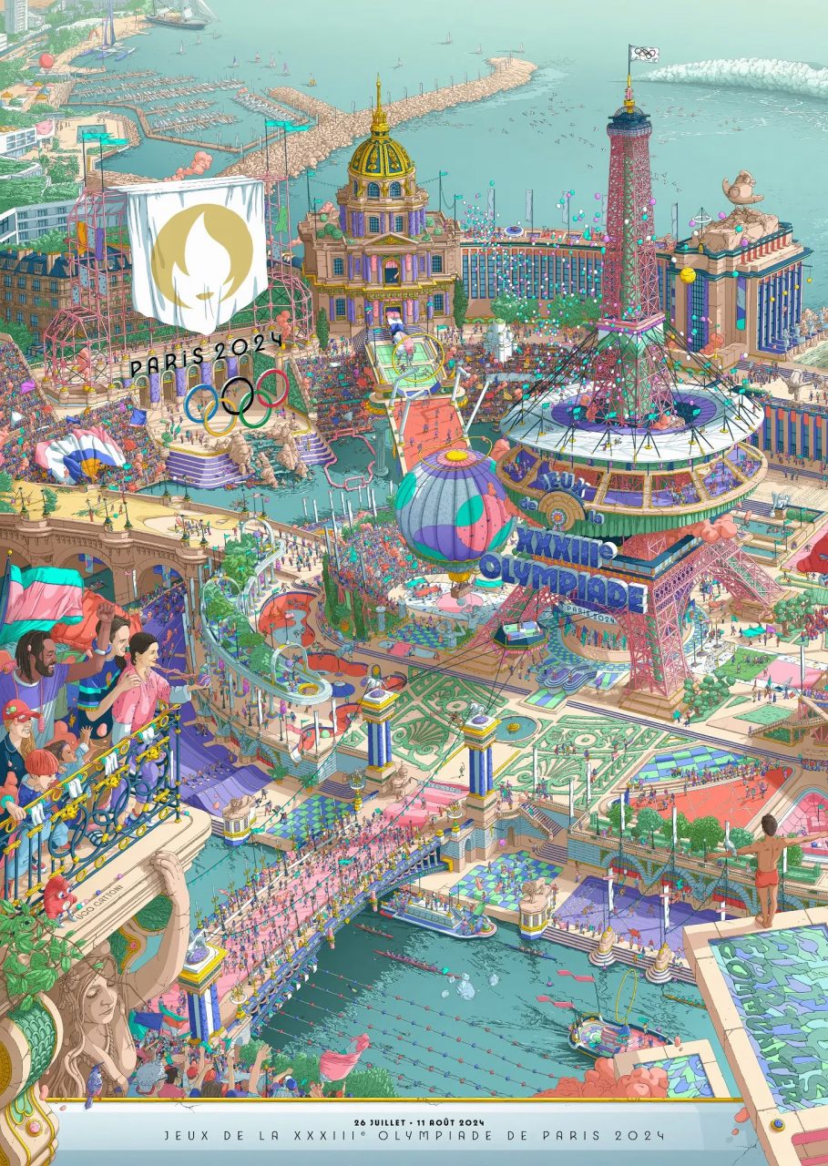
This year, the Paris 2024 Olympics will feature posters filled with dreamy, detailed bird's-eye landscapes.
Paris 2024 Olympics
This year, in Paris, the posters feature a dual design that blends the Olympics and Paralympics. This marks the first time in Summer Olympic history that the Olympic and Paralympic posters have been designed together. Artist Ugo Gattoni created a “pointillist landscape” entirely by hand, despite its seemingly computer-generated look. The lively tone of the poster, reminiscent of a carnival, references the World Expos held in Paris during the early modern Olympic era. Using colourful dots, Gattoni skillfully interweaves mini scenes and stories into the design. The poster aims to capture attention with its large size, and then allow viewers to explore the detail-rich composition and intricate narratives that lie within.
Translation by Sophia Zhang

Editor
Benjamin AU


