When it comes to Olympic motifs, the five Olympic rings – comprising five interlinked rings in blue, yellow, black, green and red – are among the most significant ones of all. This design is the brainchild of Pierre de Coubertin, the founder of the modern Games, in an effort to promote the Olympic spirit: the union of the five continents. From its advent in 1913 to the present day, the Olympic Rings have become more than just a symbol of the Games. Many Olympic athletes, coaches, and even staff proudly display the emblem, whether as a badge on a tie or a tattoo peeking out from under a sleeve—the Olympic Rings have transcended into something to live by. Beyond this universal symbol, each host country is tasked with creating a logo that highlights its cultural traditions and national style. These unique emblems represent the host nation’s characteristics and, when paired with the Olympic Rings, form a bridge between Olympic Games past and present.
Historically, throughout the first half of the twentieth century, Olympic logos primarily featured the five rings as the central element, accompanied by the host city’s name and the year of the event. It is only in recent years that we have seen more distinctive designs, such as the current emblem, which immediately evokes the silhouette of a woman’s face. The Rings have become distinct visual symbols in their own right, each with its unique design language after more than half a century of evolution.
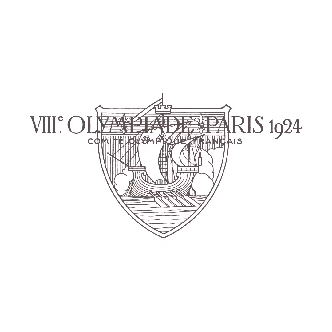
A hundred years ago at the 1924 Paris Olympics, the logo was full of antiquity, featuring a coat of arms.
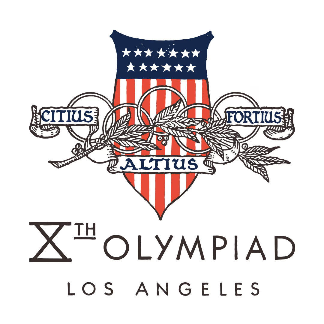
In 1932, the Los Angeles Olympics added the motto ‘Citius, Altius, Fortius’ (faster, higher, stronger) to the logo, whilst the design remained elegant.
Coat Of Arms And Logos
Historically, families with long lineages and their inherited trades often had a coat of arms design as a logo. Over time, a trend emerged where logos were crafted using the initial uppercase letter of the family name as the core element. Most of the logos on seals and emblems were accompanied by images of mythical beasts, wings, a circular crown of laurels, or palm leaves symbolising victory. During the nascent stages of Olympic logo design, these traditional elements were incorporated to complement the five rings. For instance, the logo for the 1924 Paris Olympics, exactly a century ago, featured an antiquated shield. By the 1932 Los Angeles Olympics, the addition of the motto “Citius, Altius, Fortius” (Faster, Higher, Stronger) was elegantly displayed. The design style of that era favored a decorative, illustrative approach rather than creating a memorable graphic.
The five rings, with Montréal’s letter ‘M’ as the design’s core; this logo was used on tickets, posters and graphics within the venue.
The lines that make up the five rings converge and highlight the central red star; this reflected the socialist aesthetic of the 1980 Moscow Olympics.
Enter Modern Designs
By the 1960s, design philosophies began to shift significantly. The industry rode the wave of redesigning logos, embracing the Corporate Identity System concept. This approach proved new ways for enterprises to identify themselves: large corporations across Europe and America swiftly replaced their traditional, ornamental, or family crest-like logos with simple geometric patterns. The intention was clear—enhance recognisability and make the logos more memorable. This emphasis on structural integrity and ratios meant that techniques could be replicated elsewhere, unlike the hand-drawn, decorative designs that were open to interpretation. The goal was for viewers, regardless of location, to perceive the logo in the same way—simple and direct, much like the Olympic Rings.
For the 1967 Olympics in Canada, designer Georges Huel created the primary logo for the event, COJO, which combined the Olympic Rings with the initial “M” for Montréal. This design employed a grid system and specific colour scheme for printed materials. The three design elements—Olympic Rings, COJO logo, and designated colors—were consistently used across tickets, posters, and venue signs. COJO was the French acronym for the organizing committee, fitting as Montréal is a French-speaking city in Quebec. Consequently, all publications and memorabilia were published in English and French.
The 1980 Moscow Olympics introduced a logo representing the geometric beauty of socialist-style monuments. Designed by Vladimir Arsentev, the logo featured lines converging into a central red star, reminiscent of Stalinist architecture with its skyscrapers and minarets, built in Moscow between 1949 and 1956. Both the 1976 and 1980 logos referenced that of the Munich Olympics, emphasising modern, straightforward designs.
The “Sunbeam Emblem,” designed by Coordt von Mannstein for the 1972 Munich Olympics, presented meticulously arranged concentric rings, forming a spiral geometric pattern symbolizing the rebirth of Germany. This logo, combined with vertical lines and the Univers 55 typeface, was used across all official materials, including first-day covers and other publications.
The mascot Cobi’s outstretched arms perfectly recall both the logo and the Olympics’ message of friendship.
Barcelona’s passion invigorates its logo design with a sense of movement.
Contrasting with the intricate aesthetics of West Germany, the 2016 Rio Olympics’ logo exhibited a South American feel.
By the 1990s, the Olympic logo had moved away from the pursuit of geometric precision. The logo for the 1992 Barcelona Olympics, designed by Josep Maria Trias, captured the city’s vibrant spirit through a dynamic human figure seemingly leaping over the Olympic Rings. The simple lines and Mediterranean colour palette nodded at the artistic influence of Joan Miró. The mascot for this Game, Cobi, embodied warmth and the Olympic spirit with its outstretched arms, complementing the logo’s design. The adorable Cobi was created by Javier Marsical, and is an adaptation of the Pyrenean mountain dog.
At the 2016 Brazil Olympics in Rio de Janeiro, the logo featured a dynamic, three-dimensional design integrating nature motifs, aptly reflecting South America’s beauty and creating a contrast with West Germany’s intricate disc structures.
Levi’s and Converse were the official suppliers of apparel and footwear for the 1984 Olympics in Los Angeles. Labelled apparel was particularly popular, and through this, one can observe the design techniques and fashion trends of the time.
The colour black is less frequently seen in Olympic merchandise; Zildjian is a well-known instrument manufacturer specialising in cymbals. The photo shows a bespoke product made in partnership with the Olympics, which is a rare item on the second-hand market.
Logos And Souvenirs
After residing in Paris this year, the Olympic flame will make its way to California for the next Games. In the past, the cities where the Olympics took place were classified as “host cities”, but “operator” is a better description for California with the 1984 Games: The Summer Olympics in Los Angeles was the first of its kind to be run as a business model, and it was very profitable.”LA84,” like previous organising committees, raised funds and sold television broadcasting rights as part of its early organizational efforts. Additionally, “LA84” introduced sponsors and designed and produced a large number of souvenirs featuring the Los Angeles Olympic logo, making the Olympics a profitable event for the first time. This made the Olympics a profitable event for the first time. Apart from boosting the country’s image, uniting people, and demonstrating sportsmanship, there were also financial benefits, meaning that countries competed for hosting rights at subsequent Olympic Games.
The Financial Success Of The Olympics
The Olympic Logo is intrinsically linked to the Games’ financial success. Take the LA84 Logo for example: this logo, composed of red and blue, is also known as “STARS IN MOTION.” It features a precisely designed grid with a highly artistic five-star pattern. Designed by Robert Miles Runyan, the logo employs an OP-ART-like optical illusion effect to create five stars that seem to be in motion, comprising of gradually thickening horizontal lines. These five stars, as well as the five Olympic rings, have become widely used in souvenirs and on many types of advertisements – after looking at it for a while, doesn’t it remind you of New Balance’s NB logo? It does, because both use a similar optical illusion effect, and both emblems come from the United States: this is from the East Coast, whilst the Olympic logo originates from the West Coast.
So, what does the Paris 2024 logo mean? Considering that Paris is a fashion capital, the logo of its Games will probably give rise to very different opinions.


Editor
Benjamin AUCredit
Photo courtesy of IOC


