Jason Yung and Caroline Ma attach great importance to telling the story of every homeowner through design. They were even involved in choosing the location for their college friend’s southside home. “She’s been wanting to buy a new home since a few years back. We accompanied her on her search, but we couldn’t find a suitable unit — until now. It was a matter of having the right people in the right place at the right time. All of us agreed that this place had the potential to be remodeled, so we started to discuss our ideas with her.” To Caroline, this project is special because of how well they knew the homeowner. “We used to face difficulties in the design process, for example, we must build trust with the homeowner before we can confirm and execute certain details in our design. This time, we knew the owner’s living habits and preferences very well so ideas came really naturally.”
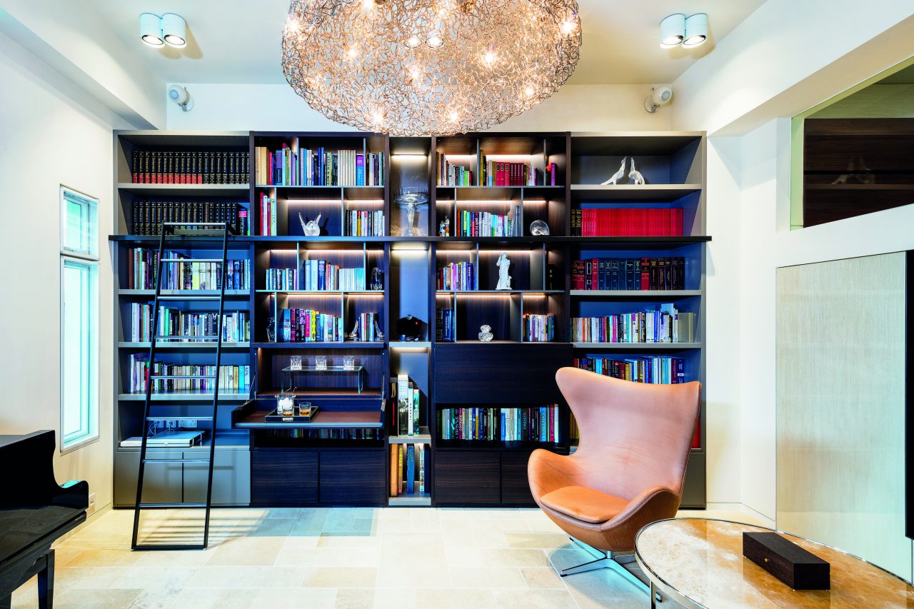
Stepping into the living room leads to the library and music room, where Poliform's multifunctional cabinets also double as a small bar.
Photography by John Butlin
Upon entering the house, the first space that comes into sight is the music room and library. A row of custom-made bookcase cabinets from Poliform neatly line the walls, while the piano elevates the room. “I know the owner’s preferences very well as she is my close friend. She prefers listening to music and reading rather than watching movies, so we put a lot of thought into the design of the living room. For example, the Poliform cabinet can be flipped down to double as a bar countertop and it also has built-in lighting — all custom-designed by us.” The two also deliberately chose cathedral stones as floor tiles, which is rarely used. “This stone has two characteristics. Firstly, it comes in different sizes; secondly, the surface of the stones are uneven but smooth, creating an interior that is reminiscent of an ancient castle. The interior is adorned with a lot of unique intricacies, creating a modish yet artistic space. “The owner often invites friends over to the house, so this space acts as a big party foyer. My daughter also practices piano here sometimes!”
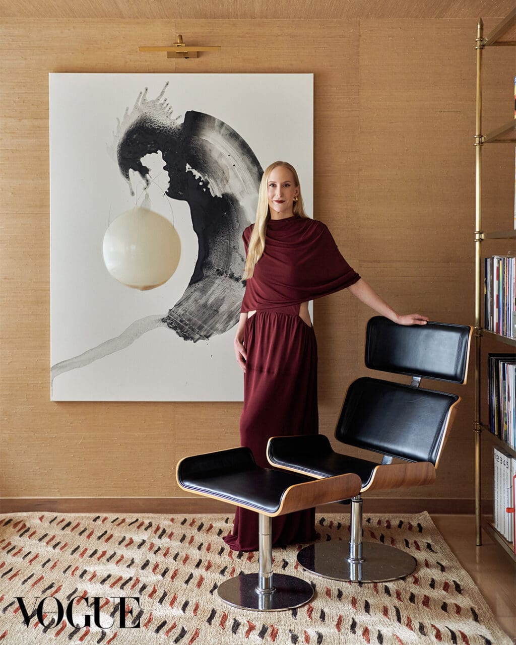
A pair of chairs from Poliform add infinite comfort to the space.
Photography by John Butlin
From conception to completion, the whole project took about a year. Walls were knocked down between a lot of spaces in the house. “Except for the master bedroom, the rest of the spaces are interconnected. You can see every space in the house no matter which floor you are on. When you are in the dining room, you overlook the music room, see the kitchen on the same floor, and get a glimpse of the family room upstairs. Each floor is connected by a see-through glass staircase. The owner lives alone, so she can also feel safer when she sees what’s happening around her.” As their friend likes simple and clean designs, the two designers put a lot of effort into creating a stone-brick staircase with a crystal frame for her. The stone glimmers if you take a close look. “We chose to build a glass staircase to avoid additional railings, so that the owner can see all the spaces in the home when they go up the stairs, creating a flow of space.”
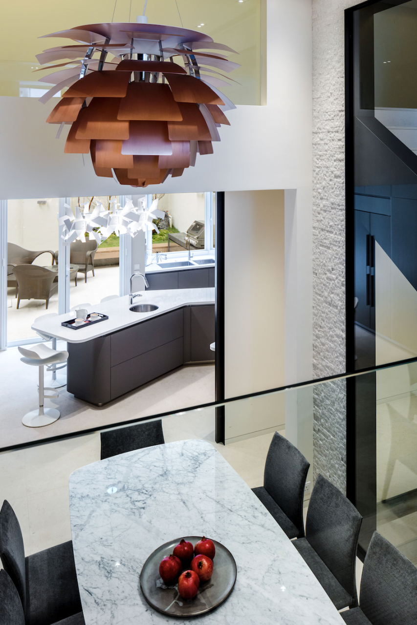
The multi-storied home is opened up, fluid interiors allow the flow of space.
Photography by John Butlin
There were also unexpected surprises during the design process, such as the addition of the dramatic Louis Poulsen PH Artichoke chandelier. “We didn’t want to purchase lighting that was too luxurious and over the top at first, but we incorporated this chandelier in our design in the end as the owner thought it was unique. It was worth the money as its light penetrated into every room in the house. This is what’s special about creating a flow of space — the whole home feels open and connected. When the lights are off, the chandelier can be appreciated as a work of art.”
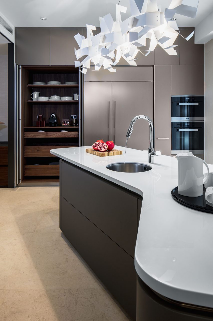
The kitchen island from Italian brand Effetti has rounded corners, reducing the chance of injury. The Glow chandelier in the kitchen is from Italian brand Pallucco.
Photography by John Butlin
The kitchen island is shaped like a hook, departing from the traditional circle or rectangle, welcoming the owner to the kitchen from the garden outside the house. “If the kitchen island is square, the sharp corners of the cabinets can easily hurt people. So we found an Italian brand named Effeti, which specializes in round-cornered furniture. The inner corners are also rounded, which is very unique. The tall cabinet on the other side of the kitchen is made by another brand called Bulthaup b3. We’ve created this space to be the pantry so that it is convenient for the homeowner to store her kitchen utensils.” Since Chinese people are used to cooking local cuisine, the two designers added a large sliding door to the kitchen to separate the kitchen and dining room so that the owner can see the garden from the dining room.
The moss garden outside the kitchen.
Photography by John Butlin
The outdoor BBQ kitchen makes a good space to gather with friends.
Photography by John Butlin
In Jason and Caroline’s design projects, the garden is often located opposite the kitchen. Caroline explained: “Frankly, having a garden in your home is a luxury in Hong Kong. Many large houses in the city do not have a garden, and some people choose to transform their lawns into stone paths. But to me, there should be an oasis within a home no matter its size. We are very lucky to be able to keep the moss garden as the weather in Hong Kong is hot under the scorching sun. Generally speaking, a moss garden requires a lot of attention from its owner, otherwise it will easily dry out. Fortunately, this house is not directly exposed to the sun.” Moreover, there is also an outdoor BBQ kitchen in the garden. “Although many people will buy a barbeque grill, we chose to incorporate it in the outdoor kitchen to match the other modern elements of the home. The three kitchens in this house — the outdoor kitchen, the kitchen island and the pantry — are all interconnected. We hope to make good use of every space. The owner can sit in the kitchen and appreciate her garden, but she can also close the door and enjoy her music in the living room.”
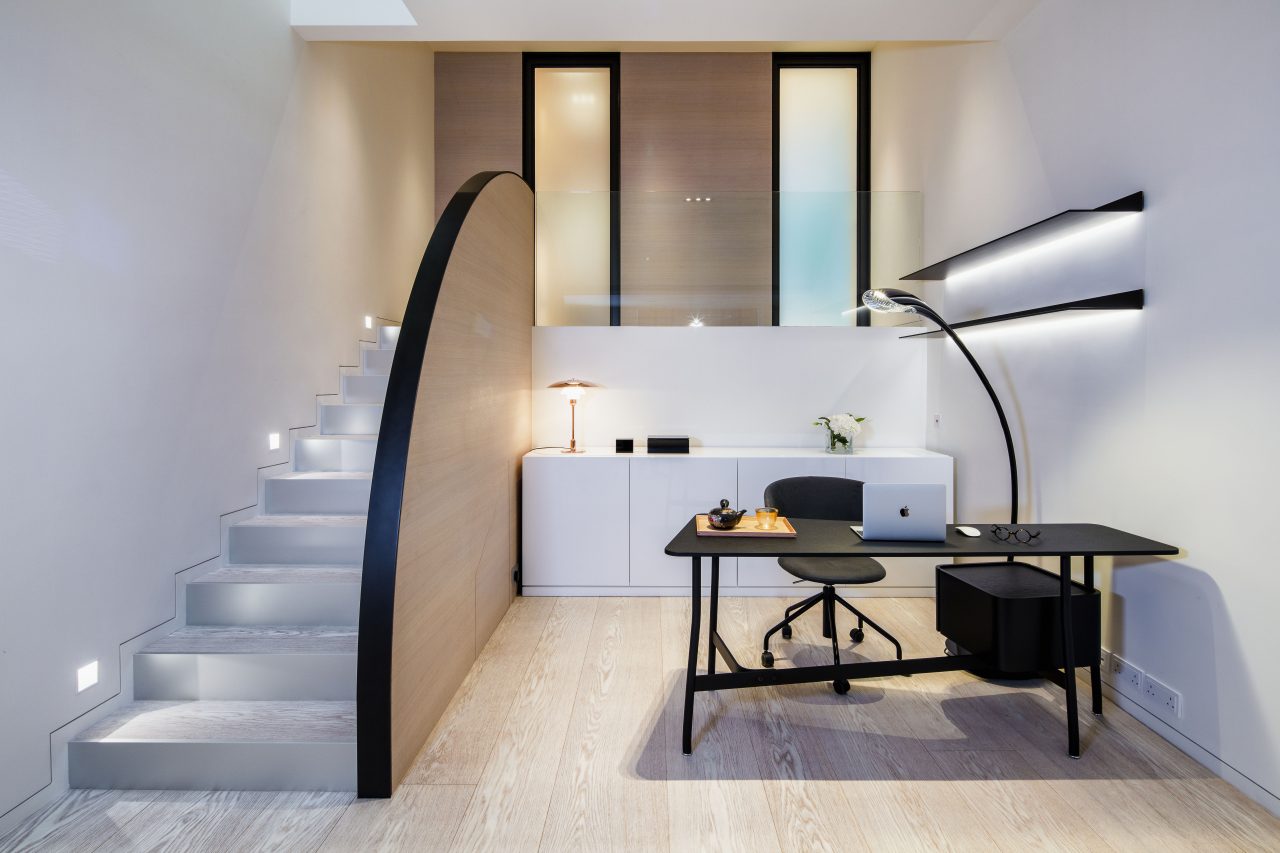
The master bedroom is designed as a "house within a house" to create a quiet space for rest.
Photography by John Butlin
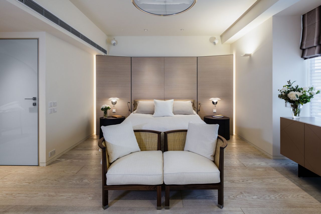
The master bedroom is also full of curvilinear elements that soften the space.
Photography by John Butlin
The clean, white palette of the bathroom relaxes the body and mind.
Photography by John Butlin
By incorporating a lot of curvy furniture silhouettes into the interior, from the kitchen island to the master bedroom, the two designers lent a feminine touch to the home. The master bedroom is like “a house within a house”. “We opened up the two-storey master bedroom and separated half of the room from the stairs in the middle of the room with a curved wall. The space on the other side of the wall acts as a study and office, making the room feel like it is a house within a house.” On top of the stairs is the walk-in closet and the bathroom. “We used a lot of curved design elements in this room as the owner is a woman. The curved lines and silhouettes soften the environment. The sink is curved, and even the floor lamp is bendable. We also made a circular shower with frosted glass, and the light is specially designed to complement this element. While there is a circular staircase in the office, the lines used in that space are comparatively more stiff and rigid. From looking at the house together to designing her home, this collaboration with someone we know well was particularly meaningful.”
Editor
Karma CheungCredit
Photography by John Butlin


