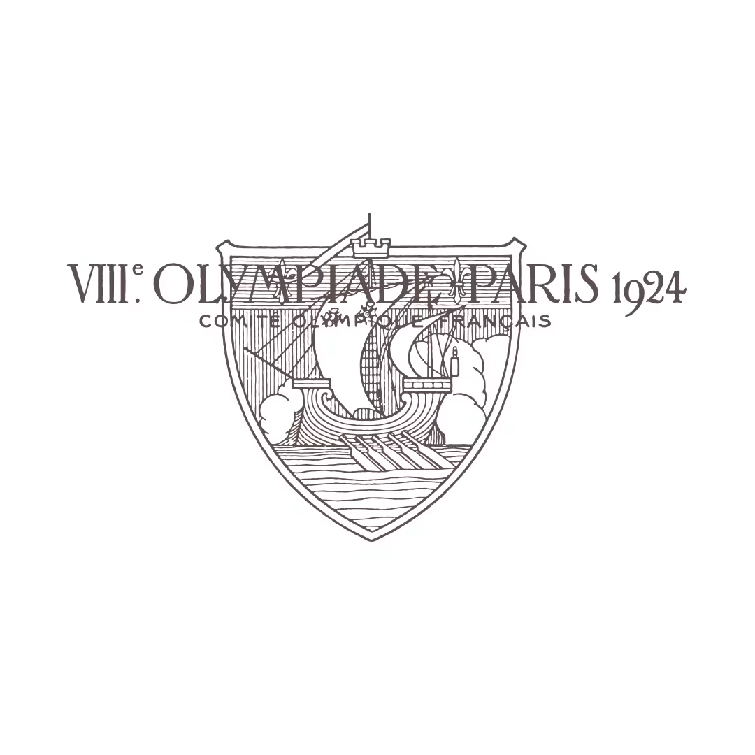
A hundred years ago at the 1924 Paris Olympics, the logo was full of antiquity, featuring a coat of arms.
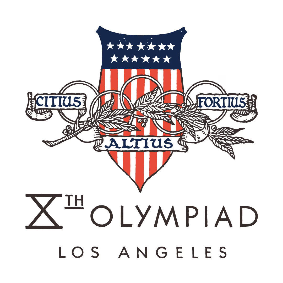
In 1932, the Los Angeles Olympics added the motto ‘Citius, Altius, Fortius’ (faster, higher, stronger) to the logo, whilst the design remained elegant.
談到讓觀眾印象深刻的奧運標誌,多半是奧運五環,以藍、黃、黑、綠、紅五色相互扣連的圖案,想當然是來自現代奧林匹克運動會創始人Pierre de Coubertin的巧思,推動奧林匹克精神來達成連結各洲全體人類的願景。從1913年誕生到今天,Olympic Rings已不只是一個奧運標誌,許多奧運選手、教練甚或是工作人員,多會將五環標誌伴隨在身,可能是綴於領帶的鑄章,又可以是若露於衣袖下的紋身圖案──奧運五環已然昇華成一份信念。在此之上,每屆主辦國亦需要一個能突顯傳統文化與國族風尚的符號,以代表主辦國的特色,輔以五環,連結各屆奧運的接點。
觀乎整個設計進程,二十世紀上半葉的奧運標誌因此直接以五環為主體,各配上主辦城市名和舉行年份便成,是直至近年,譬如本屆一看便會聯想到女性面龐輪廓的意像,其實是已經過半百年的進程,奧運標誌和五環方在設計語言上成為各自精彩的視覺符號。
盾徽和標誌
具有悠久歷史的家族,與其所承襲的行業,多有盾飾般的紋章圖案的標誌;發展至後來,利用名稱首個大寫字母作為核心元素設計成的標誌樣式更蔚然成風,大部分圖章式或是徽記式的標誌,都有瑞獸相伴、翅膀襯托,或是圍繞成圓形的桂冠,與象徵勝利的棕櫚葉。於是在奧運標誌的搖籃期,這些傳統特徵都被納入成襯托五環的元素,從剛好一百年前、1924年的巴黎奧運,其標誌便是滿有古意的盾徽;至1932年美國洛杉磯一屆,增添的Citius、Altius、Fortius(更快、更高、更強)的格言,仍然以優雅的圖式展示,設計模式上選擇花飾的繪畫感而非構思一個讓人銘記的圖案。
The five rings, with Montréal’s letter ‘M’ as the design’s core; this logo was used on tickets, posters and graphics within the venue.
The lines that make up the five rings converge and highlight the central red star; this reflected the socialist aesthetic of the 1980 Moscow Olympics.
現代設計進場
時至1960年代,設計意念開始起變化,業界趨勢開始把商標作一次重新設計,Corporate Identity System的概念成為了企業嶄新的識別提案:一時間整個歐美的大企業都把傳統具有裝飾美或家族紋章式的標誌一掃而空,重新換上以幾何元素拼湊而成的簡單圖案——簡明的原意是提昇識別度,讓人更容易記得。
這種強調完整結構及有法可依的比例,用意是在其他地方也能按原樣複製,而非花飾圖案那類偏著重手繪的隨意性,使身處每個地方的觀者所接收的標誌完全相同,簡單直接如同奧運五環。
加拿大於1967年舉辦的一屆,大會主體標誌COJO由Georges Huel設計,以五環配上主辦城市蒙特利爾(Montréal)的字首「M」來襯以印刷品採用的柵格系統與指定色概念。五環、COJO標誌與指定色這三種設計元素同步沿用於觀眾門票、海報與場館圖示上。COJO為該屆籌辦委員會的法文簡寫,亦因位於加拿大魁北克省的蒙特利爾是法語城市,故此出版物與紀念品一併有英法兩種語言標註,依照大會所訂下的標準製作。
1980年莫斯科奧運會設計莊嚴亦具幾何美感的大會徽章,則全為社會主義樣式裡紀念碑般的漂亮範本,這個由Vladimir Arsentev設計,五環線條匯聚「拱照」着中央紅星,展現了1949至1956年間於市內興建的史達林式建築──尖塔與摩天大廈為蘇聯首都展現的印象。而1976與1980兩屆之所以能設計出簡明富現代感的圖案,均是從慕尼黑奧運擷取的經驗所至。
Sunbeam Emblem這幅由Coordt von Mannstein所繪畫的太陽紋章,以最嚴謹的態度,呈現出每道圓環之間的緊密有致,就是1972年奧運的大會標誌。這組光輝圓環呈螺旋型遞增的幾何圖案,象徵新生的德國,配合垂直嵌線與Unveris 55字體組構成的總體結構,應用於所有官方資料包括首日封和其他出版物。
The mascot Cobi’s outstretched arms perfectly recall both the logo and the Olympics’ message of friendship.
Barcelona’s passion invigorates its logo design with a sense of movement.
Contrasting with the intricate aesthetics of West Germany, the 2016 Rio Olympics’ logo exhibited a South American feel.
到了1990年代,大會標誌已隨時代關注的焦點而滲進自然風格,並不過於追求完美工整,如同1992年西班牙一屆,巴塞隆拿的熱情洋溢被投注由Josep Maria Trias所設計的標誌裡,充滿活力的人物形象,像是跨越五環的姿態、簡單線條與地中海的熱情配色,筆者甚至感到有着大師米羅Miro的意匠,帶有音樂的躍動感。更進一步是這屆的吉祥物Cobi,它的標準pose是一個張臂動作,完全呼應標誌之餘,無形中亦傳遞著奧運的友誼形象。可愛的Cobi是比利牛斯山犬的化身,由Javier Mariscal創作,而這種主題風格在2016年巴西里約熱內盧的一屆趨於極致,更出現立體的動態圖案,把自然和諧的多樣性融於奧林匹克精神,對照起西德光輝圓盤的精密結構,2016年的標誌非常切合南美的風貌。
Levi’s and Converse were the official suppliers of apparel and footwear for the 1984 Olympics in Los Angeles. Labelled apparel was particularly popular, and through this, one can observe the design techniques and fashion trends of the time.
The colour black is less frequently seen in Olympic merchandise; Zildjian is a well-known instrument manufacturer specialising in cymbals. The photo shows a bespoke product made in partnership with the Olympics, which is a rare item on the second-hand market.
Logo Tee for Olympics
奧運聖火這屆暫居巴黎後,下屆將再度走進加利福尼亞。那麼美國是如何營辦奧運的呢?是的,之前的主辦城市皆為「舉辦」、而「營辦」是作為1984年加州一屆的最貼切形容:洛杉磯舉行的夏季奧運會,首度以商業模式營辦,並大幅獲利。「LA84」如同往昔的籌委會,透過前期募金、出售電視轉播權等基本原理作為前期籌組工作,「LA84」更引進贊助商、設計生產大量附有洛城奧運標誌的紀念品,使奧運會首次成為賺錢項目,在提升國家形象、團結人心所向、體現運動精神外,還有財政收益,往後幾屆的主辦國家更爭相競標奧運主辦權。
奧運財來自有方?
了解如何進行營銷以帶來業務增長的生意經後,文末可簡報一下這些official product得以賣錢的核心原因──產品上的LA84 LOGO。這個以紅藍兩色組成的標誌又稱為「STARS IN MOTION 」,為經柵格設計嵌線準確,充滿設計感的五星圖案。由一身西部牛仔服飾打扮的Robert Miles Runyan所設計,以近似OP-ART的錯視效果,於漸次遞增的橫線中呈現出星形圖案,整體透過留白手法呈現全數五顆星星。圖案以左右橫線的聚合產生動態效果,與運動主題非常配合,五星襯奧運五環成為商標大舉呈現於紀念品和各式平面廣告之中,看多了覺得有點像是NEW BALANCE的NB標誌?是的,因兩者皆採用相近的錯視效果,兩者也都典出美國,此為東岸,彼為西岸。
來到最後,本屆巴黎奧運的標誌意屬哪一方?初始觀感,復再加入主辦國法國的時尚美學來考量,大抵會給出大眾兩個全然不同的評價。


Editor
Benjamin AUCredit
Photo courtesy of IOC

